Simple Moments
- Chelsea Papaver
- Feb 11, 2024
- 4 min read

Updated: Feb 25
Creating takes a unique type of confidence that I simply describe for myself as “just having the audacity”. I say this because I rarely execute a plan from start to finish the way I initially intend. There’s almost always some little problem that comes up in my creative process but I like a challenge so I’m happy to be persistent. The creation process for this piece is the perfect example of this type of situation!
The Idea


The above images are:
The second sketch that was the first rough draft with color
The canvas I used
I started with a staircase and decided to build from that design. I thought “oh a nice little geometric design, this will be easy!”... wishful thinking.
The first sketch was low risk as I just needed to get my ideas on paper. The second sketch was more purposeful though because the idea was to be able to transfer that image to the canvas. I’m a planner, I wanted to have everything mapped out and ready to go. Although I liked the idea of the color scheme, when I started to copy it to the canvas, I quickly realized I failed to consider the scale ratio! Copy paper has an aspect ratio of 1 to 1.414 while my canvas was closer to a 4:5 ratio.
The Sketch:


Sometimes I have to remind myself that I had full creative control over my projects. I decided to not let the inconsistency bother me. I simply worked with what I had, created a similar pattern with more details, and finished the sketch!
Using Technology to Map Colors:


Although I managed to recover the geometric design as an idea, I still needed to rework the color placement. Without giving it too much thought I started filling in some of the shapes with yellow and red as I saw fit. I knew I wanted to use a colorful yet sophisticated color palette that included red, blue, yellow, and sometimes black and white but once I finished the red, I was at a loss for ideas. This was on January 11th.


On January 31st I decided to utilize Procreate to help me decide on a color scheme. I took a picture of my canvas as it was and traced a very rough outline from the lines. I spent around 3 hours going through a variety of different colors, figuring out the functions of Procreate, and trying to stay focused. After much contemplation I was finally happy with this design! Adding green to the color scheme gave it the extra layer of flair I thought it needed. Once I completed the digital design, I sketched in the additional lines I added in the digital draft to the canvas.
Then it was…
Time to paint!


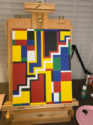
I started by repainting the yellow and red areas to refresh the colors and make sure they perfectly matched the new areas of those colors. It was easier to use an easel for this canvas because of how much larger it was than the paper I would normally use for a video. After finishing the reds and yellows, I mapped out the blues and painted those areas. I repeated this step with all of the remaining colors.


Once the painting process was complete, I used black Posca markers to finish the outline. Posca markers are my favorite paint pens because they are extremely pigmented! The ink doesn’t bleed but it does fill in the little textured areas of my paint and canvas where I need it to. After I outline the painting, I finish the edges of the canvas with a black paint. Since gallery wrap canvases are so thick, you wouldn’t really need to frame it if you didn’t already want to with the finished look of the black outline.


To varnish this piece I used Gamvar! I used to use a spray varnish but I wanted a more glossy look that I couldn’t achieve with spray varnish. I prefer to use disposable sponges with Gamvar because it’s not like paint, I feel like it’s more difficult to get out of my brushes. There’s also not a chance of there being brush strokes if you use a sponge; although you should still be mindful of little air bubbles that might form when the sponge (or brush) moves across the canvas too fast.


I also created a digital version of this piece in Procreate! In total it took me 2 hours. Straightening the black lines and then correcting them after filling in the color were the two most time consuming and tedious tasks of this creative process. As expected, the digital outline is “more accurate” in a sense than my physical piece. For my physical piece, I draw the lines with my hands as steadily as possible but I’d rather there be traces of human activity than for me to feel the need to achieve an idea of perfection that could not be realistically obtained in this process.
Here is a look at the final physical and digital pieces!


As always, thank you for reading, I hope you enjoyed the insight into my creative process and I hope to see you next time!


Comments